With so much choice, the best starting point is personal authenticity say Kale and Aubrey Butcher
Tile has come a long way from the days of polished subway and tumbled mosaics. Neutrals still have their place, but there’s a growing embrace of color, pattern, and personality. From boldly tiled walls to statement floors and dramatic marble, we’re seeing more freedom in how tile is used. Choosing the right tile has become less about what is mainstream and more about showcasing individuality within the home.
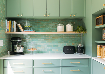
Black, white, grey and beige have stepped aside to make room for brighter tones and saturated hues. Tone on tone applications, or color washing, is also a popular concept. This means selecting one color and carrying it through the space from walls to millwork and tile too. Color washing really creates an immersive experience that leaves a lasting impact.
If color washing feels too ambitious, color blocking offers a more approachable way to bring color into your tile scheme. By pairing complementary or tonal hues, you can introduce contrast without overwhelming the space. This can be done through stacked tiles, defined zones or changing up the layout. It’s a way to create visual interest while still letting the material shine, especially when working with tiles that have natural variation or depth of glaze.
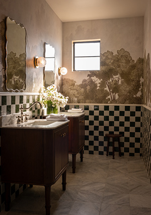
Patterned tile has been used for ages, but it’s been interesting to see how individual tiles can be composed to create whole pattern installations. Rather than printed pattern on the material itself, each tile placement contributes to a larger overall pattern. Even the simplest forms can come together to create interesting, dynamic patterns. Stripes and checkerboard installations are a terrific example of this, offering ample customization options while still feeling timeless with classic materials. You can group colors together to expand the scale for more grand spaces, or keep it small for those more intimate rooms, like a powder bathroom for instance.
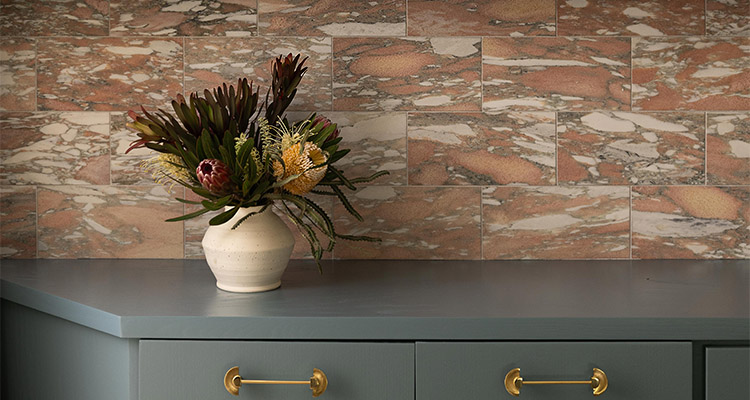
Marble is a perfect example of a classic material that is being used in a design-forward way. Rather than monolithic, subdued marble styles, the focus has shifted from restraint to expression through bolder tones and heavier veining. Whether used on floors, walls, or full-height applications, marble tile is increasingly treated as a defining element, bringing a sense of depth, richness, and permanence to the space while still feeling current and intentional. Warm tones like chocolate brown, coral and soft pink are adding warmth to spaces that white marble characteristically cannot. Green tones are having their moment as well.
With all these trends in mind, it can be really overwhelming to know how and where to implement them. Good news is, there really isn’t a limit to your creativity. We always tell clients that the biggest mistake one can make is to lean into a trend that doesn’t feel authentic to them or their space. Select colors that feel good to you, and you’ll never tire of it. Additionally, even in a fully color washed installation, the tile isn’t the only voice in the room. Textiles, countertops, lighting, and plumbing fixtures introduce contrast, softness, and dimension. These layers naturally break up the color, allowing the eye to move through the space with ease and creating a result that feels anything but flat.
Pattern is a fun way of adding a ton of impact, but the key is being intentional with both selection and scale. How a pattern interacts with the architecture of a space can dramatically influence the result. For instance, a horizontal stripe can emphasize the width of a room, but it may also highlight inevitable construction imperfections such as uneven transitions, slight shifts in millwork, or subtle inconsistencies in installation. A vertical stripe, on the other hand, naturally draws the eye upward, adding a sense of height and allowing the overall space to feel more expansive and cohesive. A small checkerboard pattern would certainly overwhelm a large space, but grouping the colors to make larger checks might flatter the scale of the space in a more appropriate way.
With all the possibilities tile offers today, it’s easy to feel like there’s a ‘right’ way to approach it. What matters most is choosing materials, colors, and patterns that feel authentic to you and the way you live in your space. When you start there, the inspiration becomes much easier to navigate, and the design feels more cohesive overall. This is what allows a space to feel both thoughtful and personal, ensuring that you’ll continue to enjoy over time.
Kale Butcher is the founder and CEO of Riad Tile, a Dallas-based eCommerce company. Since launching Riar Tile in 2017, Kale has grown the brand into a trusted destination for thoughtfully curated tile and stone, backed by best-in-class service and a commitment to making distinctive, high-end materials approachable and easy to procure. Aubrey Butcher is the co-founder of Riad Tile, where she brings a refined designer’s eye and creative leadership to the brand’s distinctive collection of artisan-crafted tile and stone. As an accomplished interior designer, Aubrey plays an integral role in shaping the company’s aesthetic direction, curating materials that balance timeless craftmanship with modern livability.