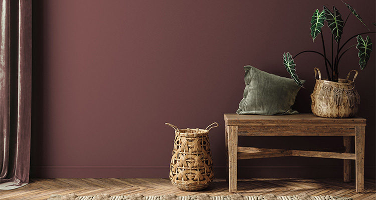
How today’s boldest paint trends are redefining the modern home. By Lauren Hoferkamp
For years, the design world told us that less was more. Cool grays dominated every mood board, white walls reigned supreme, and the safest choice was always the most minimal one. But something has shifted, and if you’ve spent any time on a job site or walking a model home recently, you’ve felt it. Homeowners aren’t just asking for a fresh coat of paint. They’re asking for a feeling.

At Dunn-Edwards, we’re seeing that shift play out in real time across residential projects, new construction communities, and design consultations. The 2026 color landscape is warmer, richer, more emotionally charged, and frankly more exciting than anything we’ve seen in a decade.
The return to heritage hues
The dominant thread running through this moment in design is what we’re calling a return to ‘colors of heritage’ – tones that feel timeless, storied, and deeply grounded. Leading this shift are warm neutrals, particularly ecru and parchment-adjacent shades that carry a soft richness white simply can’t deliver. These aren’t your grandmother’s beiges. They’re sophisticated, layered, and extraordinarily versatile, standing beautifully against stronger, more saturated accents without competing with them.
Paired with the materials homeowners continue to crave, including warm woods, handcrafted stone surfaces, woven textiles, and artisan finishes, these warmer neutrals create interiors that feel curated and collected rather than staged and sterile. It’s a palette built for real living.
Beyond minimalism: Considered or purposeful interior
The design world is officially moving past the era of stark, uniform spaces. What’s replacing minimalism isn’t maximalism exactly; it’s something more deliberate. We’re calling it ‘considered or purposeful interiors’ – those that are layered, personal, and expressive, but still architecturally clean. Think floral wall treatments alongside restrained silhouettes. Jewel-toned cabinetry paired with simple, unadorned hardware. The goal is spaces that feel lived-in and meaningful, not overcrowded or overdesigned.
For builders, this is an important cue. Homebuyers are responding to model homes that tell a story, spaces with a distinct point of view, and a sense of authenticity. Color is one of the most powerful tools you have to create that narrative.
The hues defining 2026
So what colors are actually moving the needle right now? A few stand out:
Greens, in every interpretation. From inky hunter greens to muted dusty sage-grays, green has emerged as the defining color of this moment, like Dunn-Edwards Antique Coin (DE6270). It reads as natural, grounding, and sophisticated across cabinetry, walls, and exterior accents alike.
Earthy reds and terracotta tones. The red family has evolved far beyond its vibrant primary roots. Today’s reds are muted, smoky, and deeply livable. Think Tuscan red, mahogany, and deep red-brown hues with earthy undertones. Take a look at Dunn-Edwards Outer Boundary (DE6021). These colors add warmth and drama without overwhelming a space.
Jewel tones as strategic accents. Deep emerald, sapphire blue, aubergine, and garnet are making a confident return, not as wall-to-wall statements, but as carefully placed moments of sophistication. A powder room in deep plum. A home office in saturated navy. A front door in forest green. These applications stretch homeowners just outside their comfort zone in the best possible way.
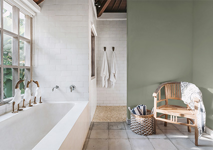
Dusty, muted undertones across the board. Whether it’s lilac, blush, mauve, or blue-gray slate, the colors resonating right now share a common quality: they’re softened. Dusty undertones give any hue a more sophisticated, less saturated appearance that photographs beautifully and ages gracefully.
Two application trends builders need to know
Beyond individual color choices, two paint application techniques are reshaping how builders approach model home presentation and spec finishes.
Color drenching, painting walls, ceilings, trim, doors, and cabinetry in a single cohesive hue, has become one of the most talked-about techniques in residential design. When done with the right color (deep greens, earthy blues, warm brown, or muted plum tones work especially well), it transforms an ordinary room into an immersive architectural experience. In model homes, drenched rooms consistently generate the strongest emotional reactions during walkthroughs. Buyers linger. They take photos. They imagine themselves living there. That’s exactly what you want.
Color capping is the natural evolution of this idea. Rather than defaulting to white ceilings, designers are painting ceilings in a coordinating or contrasting color to intentionally frame a room and draw the eye upward. In entryways and dining rooms, especially, a painted ceiling adds an element of luxury and intentionality that buyers associate with quality craftsmanship. It signals that every detail has been considered. Dunn-Edwards Taliesin Blue (DEC798) is a great choice for color capping.
Don’t overlook the front door
Exterior color is having its own moment, and front doors in particular deserve serious attention. Homebuyers increasingly treat the front door as a personality statement, and designers are responding with bold, thoughtful choices that tie together landscaping and overall curb appeal. Deep forest green, warm charcoal brown like Dunn-Edwards Tobacco Incense (DEBN79), dusty terracotta, dark teal, and muted dusty blue like Dunn-Edwards Marine Layer (DET599) are all emerging as standout front door colors that complement today’s warmer exterior palettes beautifully.
What this means for builders
What unites every trend reshaping interiors right now is a hunger for authenticity. Today’s buyers aren’t shopping for square footage alone; they’re searching for a home that feels intentional, crafted, and distinctly theirs. Color is where that story begins.
At Dunn-Edwards, we help builders turn these trends into specific, strategic palettes that stop buyers in their tracks and stay beautiful for years. The right color doesn’t just finish a space, it sells it.
Lauren Hoferkamp
www.dunn-edwards.com
Lauren Hoferkamp is Color Marketing Manager at Dunn-Edwards, one of the nation’s leading manufacturers and distributors of premium architectural, industrial, and high-performance paints, coatings, and paint supplies. It operates over 170 company stores in California, Arizona, Nevada, New Mexico and texas, and over 100 domestic and over 350 international dealer locations in 14 countries. Dunn-Edwards is dedicated to preserving and protecting the environment and produces its coatings in a LEED® Gold-certified manufacturing plant.